Hey, I’m Isaac 👋 I founded Pistachio, where we’ve worked with brands like BuzzFeed and Clay to understand their audience, build trust and deliver measurable growth outcomes.
If you want to chat about your own strategy, book a free call here.
The Return of Brand Personality
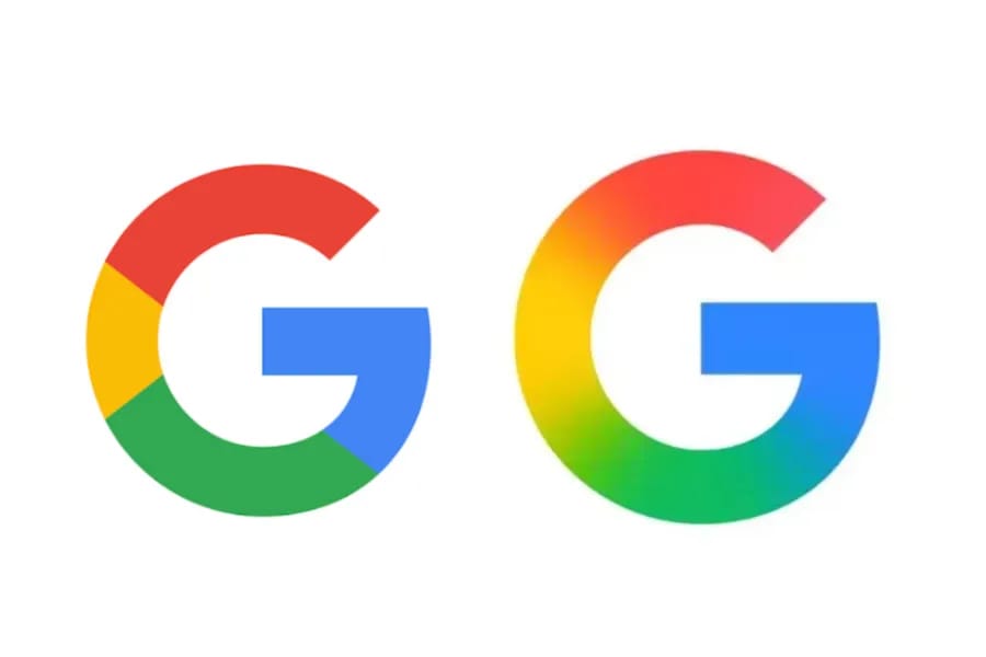
Google recently updated their logo for the first time in 10 years.
It was subtle. They dropped the solid colours for a smooth gradient, inspired by Gemini's dynamic brand. Most dismissed it as "just a minor refresh".
But this tiny shift marks the death of an design era.

For over a decade, minimalism ruled everything. Clean lines. Solid blocks. Simplified fonts. Now something's shifted. Brands are adding soul back into their design.
This isn't just about aesthetics. It's about a fundamental change in how brands compete for attention in a world where being invisible has become more dangerous than being polarising.

Minimalist Migration
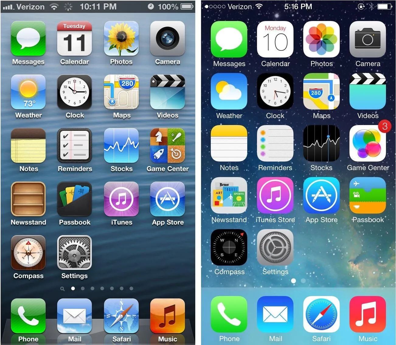
Apple's 2013 release of iOS 7 was a major shake up.
Before that update, your iPhone looked like a collection of realistic objects. The calculator had raised buttons with shadows. The notepad looked like actual yellow paper. The compass had a needle that seemed to float above the screen.

Remember when the notes app used to look like an actual notebook? Leather-bound header, yellow lined paper with margins, even a slight torn page in the app icon!
Then iOS 7 launched and everything went flat. Buttons became outlines. Textures disappeared. Icons turned into simple geometric shapes. It looked futuristic compared to the cluttered, shiny interfaces everyone else was using.
The design world took notice.
Within five years, virtually every industry had adopted the same aesthetic. Tech companies like Revolut replaced their distinctive slanted logo with plain sans serif text. Fashion brands from Burberry to Saint Laurent ditched their ornate typefaces for clinical block letters. Even banks started looking like tech startups.
Why did brands choose to homogenise?
Minimalist design was professional. It scaled across devices. It wouldn't offend anyone. It felt modern and trustworthy. In an era when brands were expanding globally and going digital-first, optimising for simplicity made sense.
But there was an unintended consequence. Everything started to look identical.
Research from Ipsos shows that distinctive brand assets are 1.15x more effective at driving branded attention than simply showing the brand name. Yet during the minimalist era, a lot of brands systematically stripped away everything that made them distinctive.
Logos became relatively interchangeable. Colours converged around the same safe palettes. Typography choices narrowed to a handful of popular sans serif fonts. Brands that had spent decades building visual equity threw it away in pursuit of looking "clean and modern".
The result was a marketplace where brands had optimised for simplicity at the expense of memorability.

When Safe Became Risky
But in the past few years something has become clear. Being invisible is now more dangerous than being polarising.
In an attention economy where consumers see over 10,000 marketing messages daily, blending in meant disappearing. The cost of looking like everyone else has started to outweigh the cost of standing out.
Then, as it has done across many fields, AI changed everything.
Claude launched with a dynamic logo that shifted and morphed. Gemini embraced fluid gradients that seemed to flow like liquid. OpenAI's brand felt organic and alive. These weren't static marks stamped onto business cards. They were living identities that reflected the generative nature of the technology itself.

One of these things is not like the others…
Every product that added AI features started using the same visual language. Gradients. Motion. Organic shapes. Even in otherwise minimal interfaces, the AI components glowed with personality. It was as if brands needed a way to signal that this part of their product was different. More advanced. More human.
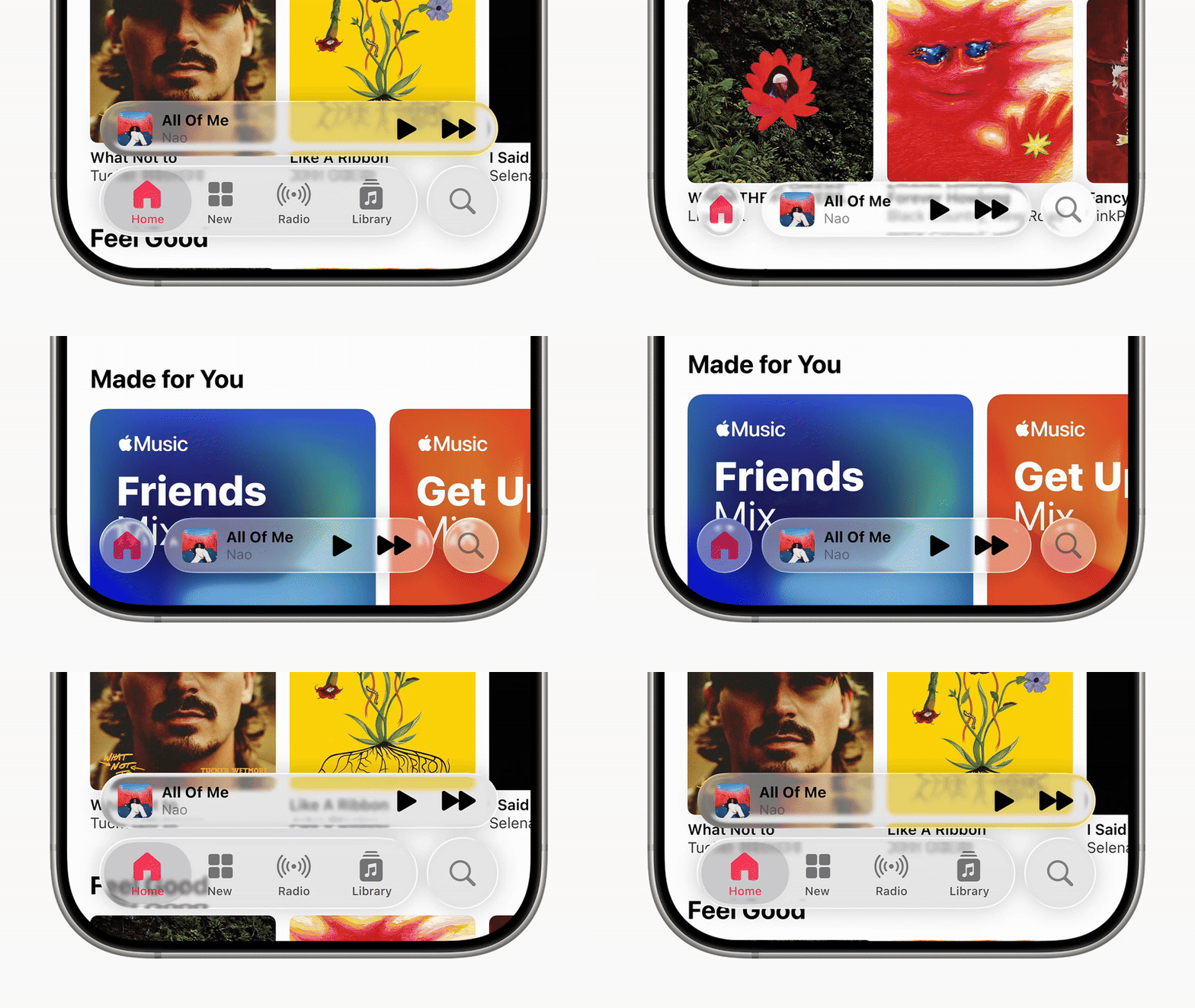
AI brands are inadvertently setting the visual vocabulary for the next decade, just like Apple did with iOS 7. Apple themselves are even coming back to more real-world aesthetics with their rollout of Liquid Glass in iOS 26.

The tools enabled this shift as well. Suddenly, anyone could create sophisticated gradients and animations without learning professional design software. AI design tools democratised complex visuals, making it easier for brands to experiment with personality.
That personality extends to all aspects of brand. As AI has become more conversational, brands realised they needed to match that warmth. When your customers can have natural conversations with ChatGPT, your corporate communications can't sound like they were written by a committee in 1987.
The barriers that had made minimalism the safe choice are disappearing.

Strategic Implications
Not every brand should jump on this trend. That's the first thing to understand.
Google's gradient evolution works because it aligns with their AI-first future. When your core products are becoming more intelligent and generative, your brand can reflect that dynamism. But if you're a law firm that's built trust through decades of conservative positioning, suddenly adopting fluid, animated branding might confuse more than it clarifies.
The key is authentic evolution rather than trend-following.
Look at the brands making this transition successfully, like Airbnb. They're not just slapping gradients or motion onto their existing identity. They're using personality to amplify what already makes them distinctive.

Airbnb replaced flat graphic designs with vibrant 3D animations across their marketing and platform.
Adding personality without losing brand equity requires understanding what your brand authentically represents, then amplifying those characteristics through modern tastes rather than just following what everyone else is doing.
But there's a courage factor here too. Blandness is inoffensive, but having any personality means some people won't like you. When you have a distinctive point of view, you inherently alienate those who disagree. That's uncomfortable for brands that have spent years optimising for broad appeal.
The strategic choice is between being invisible to everyone, or being irrelevant to some people but essential to others. In today's landscape of fragmented attention, the latter approach wins every single time.

Moving Forward
The pendulum has swung from safe to soulful and it's not swinging back anytime soon.
If you're a marketer, start by auditing your current brand assets for distinctiveness. Can people recognise your brand without the logo? Do you have visual or verbal elements that competitors can't easily copy? If the answer is no, you're vulnerable.
But here's the thing about following trends. Once everyone else adopts fluid gradients and dynamic logos, being dynamic won't be distinctive anymore. The brands that win aren't the ones that execute conventional wisdom slightly better. They're the ones that find authentic ways to stand out while everyone else looks the same.
The real insight isn't that gradients are back or that minimalism is dead. It's that in an attention economy, distinctiveness beats everything else. Including safety.
Google didn't "just" add a gradient to their logo. They signalled that they’re at the fore-front of a new wave of brands, those brave enough to have a soul, not just a strategy.
These design trends will always continue to evolve. The question is whether your brand can build the kind of authentic personality that survives those changes, or whether you'll keep chasing what everyone else is doing until the next trend makes you irrelevant again.
Because in the end, people don't remember the brands that played it safe. They remember the ones that had the courage to stand out.

If you enjoyed this post or know someone who may find it useful, please share it with them and encourage them to subscribe: brandchemistry.co/p/return-of-brand-personality
When you’re ready, here’s 3 ways I can help you
The Modern Media Masterclass walks you through how to use organic content channels to build your brand and business.
Get the clarity and direction you need to turn organic content into a growth engine that drives brand trust and business results.
I’ve worked with brands like BuzzFeed and Clay to launch, grow and monetise organic content channels that drive real business results. Book a call today and lets see how I could help you.
